
 日本
日本
 DesertX
 Diavel
 Heritage
 Hypermotard
 Monster
 Multistrada
 OFF-ROAD
 Panigale
 Streetfighter
 Superleggera
 XDiavel
 SuperSport
 Scrambler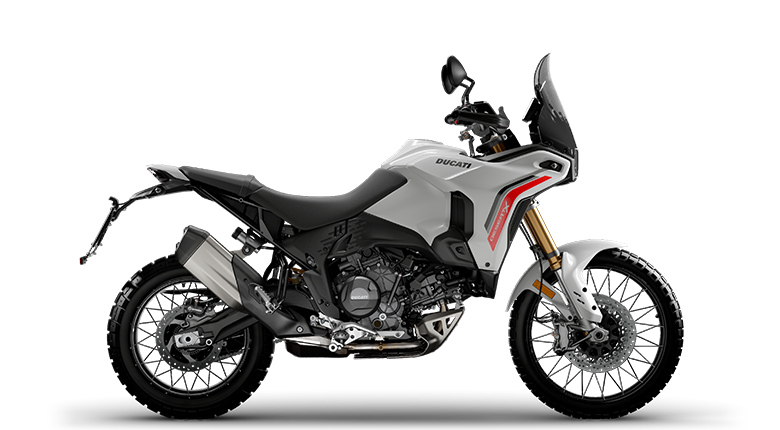
DesertX MY26
- 110 ps 最高出力
- 9.4 kgm 最大トルク
- 210 kg 装備重量(燃料を除く)

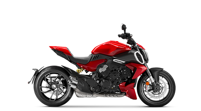
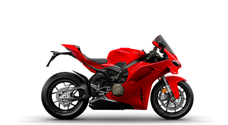
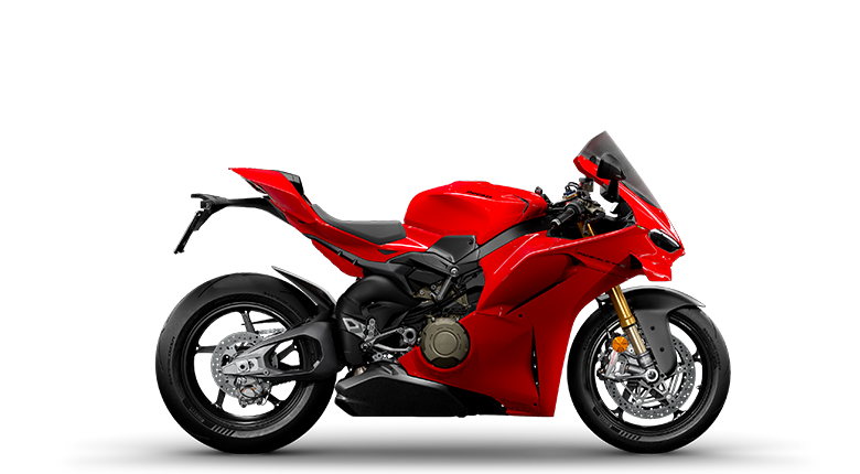
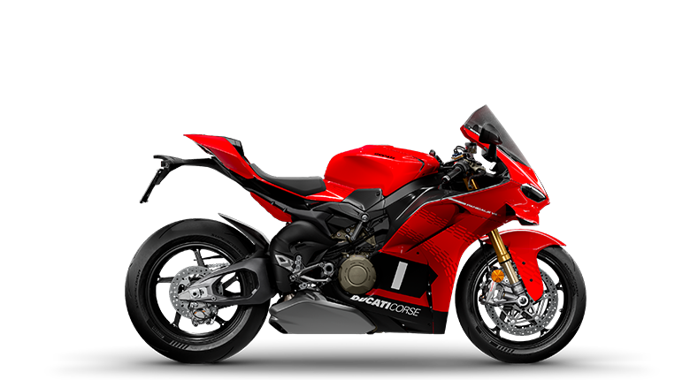
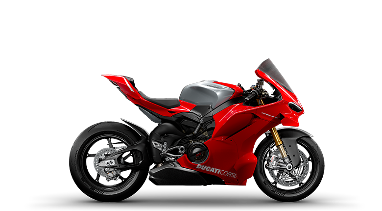
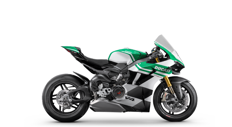
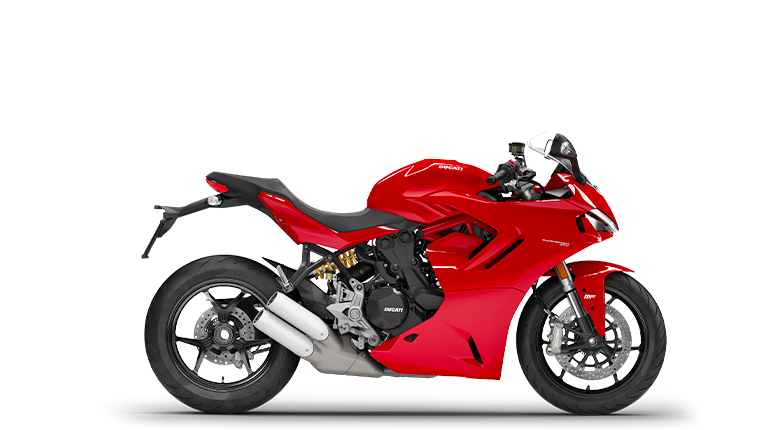
Ducati and red are an inseparable combination, but this connection was not born by chance. Historically, red is the colour that represents Italy in motorsport, a tradition that dates back to the 1920s, when the FIA (then known as the AIACR) assigned distinctive racing colours to each nation: blue to France, green to Great Britain, silver to Germany and red to Italy. Over time, this colour became a symbol of national pride, passion and speed. And for Ducati, it is much more than that.
Yet Ducati did not immediately adopt red as its signature colour. In its early decades, Ducati motorcycles were produced in a variety of colours, including grey, light blue and dark blue. Even in racing, red was present, but in shades closer to deep burgundy, far removed from the vibrant Rosso Corsa now synonymous with Ducati. This still undefined colour identity reflected a Ducati that was in the process of discovering its own identity and awareness.
A fundamental turning point came in the 1980s. During that period, Ducati was redefining its positioning and searching for a clear identity that could express its Italian and sporting spirit. It was then that the company recognised red as the perfect expression of the brand’s soul, a choice that would establish Ducati’s unmistakable presence around the world. From that moment on, red became the brand’s signature colour, a statement of belonging and uniqueness.
The first production motorcycle to definitively adopt Ducati Red was the Ducati Paso, now on display at the Museum in Borgo Panigale. But the Paso was more than just a red motorcycle: it was the first Ducati designed by Massimo Tamburini, the first model created by a true designer. The adoption of Ducati Red was therefore not merely an aesthetic choice, but the sign of a company becoming fully aware of its own identity.
The Paso was revolutionary in many ways: fully faired, with an almost automotive-inspired design, painted plexiglass, indicators integrated into mirrors that were themselves integrated into the fairing, and an unprecedented attention to detail. Red thus became part of a new language: no longer just a colour, but the symbol of a clear and recognisable identity.
Ducati Red has never changed over time. For us, colour is not simply an aesthetic choice, but a statement. Recognition is essential: Ducati is one of the very few brands in the world that can be identified by a single colour, without the need for graphics or logos. A child who sees a red motorcycle says, “That’s a Ducati.” This level of instant recognition is an extraordinary asset, built through consistency and deliberate choices.
Motorsport
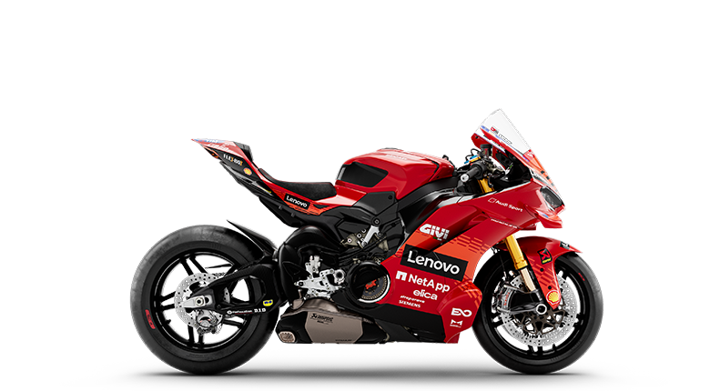
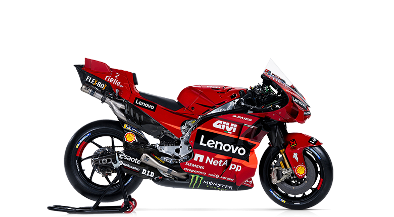
In motorsport, Ducati Red has followed an even more complex journey. In MotoGP, for many years, the colour was influenced by sponsors and television requirements, resulting in brighter shades of red and the addition of white elements. But in 2022, we made an important decision: to bring Ducati Red back to the Desmosedici GP. It was not simply an aesthetic change, but an act of consistency, a statement that Ducati and Ducati Corse are one and the same.
A Choice
Ducati Centro Stile oversaw every aspect of the brand’s design, from motorcycles to visual communication and merchandising. One final piece was still missing: ensuring that the racing bikes also followed this holistic Ducati design vision. It was not an easy task, as sponsorship requirements and television visibility impose very strict constraints, but it was a necessary step to preserve the visual consistency that is now an integral part of Ducati’s identity.
The Partnership with Pantone
Our recent collaboration with Pantone was driven by a very specific technical need: improving the colour consistency of Ducati Red across every type of material. We worked with Pantone using an empirical approach, measuring the colour of our fairings with a spectrophotometer and comparing it across 33 different Ducati products. The results revealed significant variations between products, highlighting the need for greater uniformity.
We therefore developed a custom Ducati Pantone, an exclusive shade not included in the standard colour libraries. Pantone created samples on paper, plastic, cotton and painted surfaces, calibrating each formula to ensure that Ducati Red would always remain the same, regardless of the material.
Identity and Precision
The most fascinating aspect of this journey is that, in the end, a formula alone is not enough to define Ducati Red. Just as a design brief alone is not enough to conceive and create a Ducati.
Working on this project, I realised something surprising: having the correct chemical composition is not enough. Even with all the right ingredients, the final result ultimately depends on feeling, on the emotional perception of colour. It is a perfect metaphor for Ducati: what makes a Ducati unique is not the sum of individual choices, but the emotion it creates when you see it, ride it or hear it pass by.
To celebrate one hundred years of Borgo Panigale, Ducati created a new interpretation of its most iconic colour: Rosso Centenario.
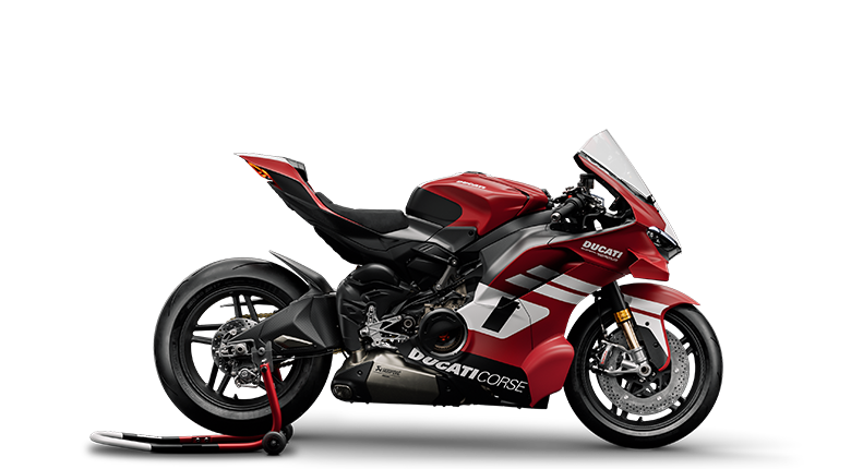
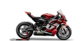
Developed for the Superleggera V4 Centenario, the GP26 Rosso Centenario livery represents the meeting point between racing heritage and contemporary vision. A red signature inspired by MotoGP’s visual language, designed to span a century of Ducati history while projecting it towards the future of competition.
Produced in an exclusive series of just 500 units, the Superleggera V4 Centenario transforms red into an even stronger expression of identity: not simply a colour, but a symbol of belonging, performance and exclusivity. A visual signature destined to remain truly one of a kind.